B2B Business loans product launch

Creating at pace in a scrappy, start-up environment to get the product to market.

Responsive design mockups for the Yozo website

the problem

a hard deadline and no website for the product.

I was engaged by a contact of mine that was running a small agency, they had just completed the branding for their client, Yozo, and needed someone with experience in user-interface design to produce the designs and flows for the Yozo website and interface for the loan application product within it.

I was only designer on the team (of two) with any experience in user-interface design and the only developer was in China only spoke a small amount of English.

Business Goals

  • Have a fully responsive site that is functional and on brand
  • Have site and features ready for the product launch

MY role | 

UI DESIGNER

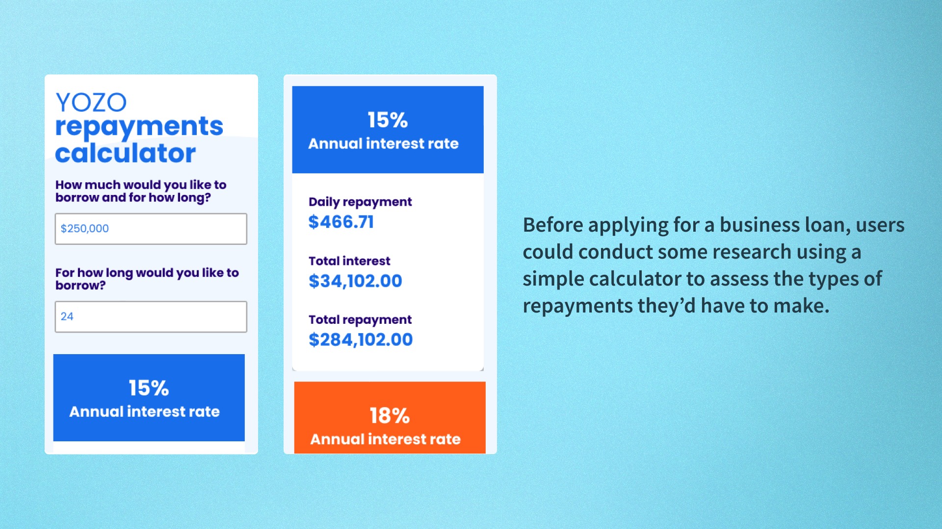
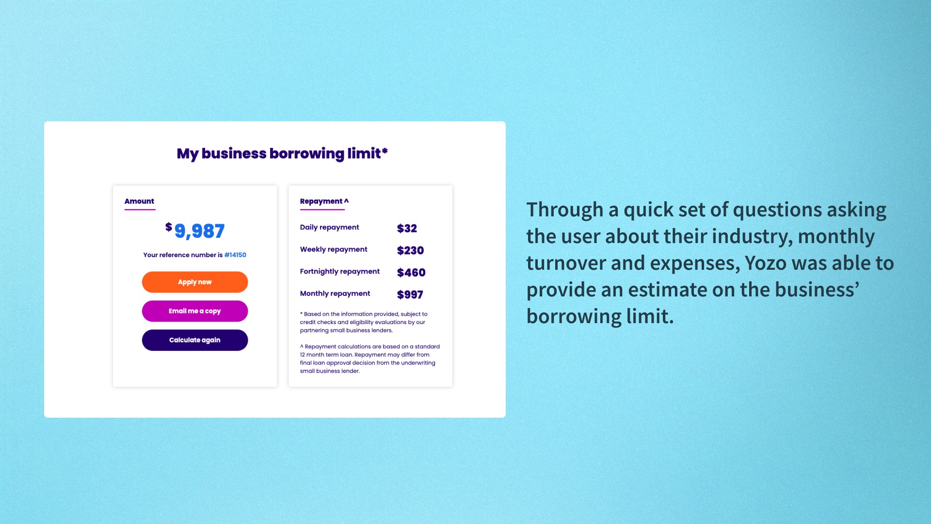
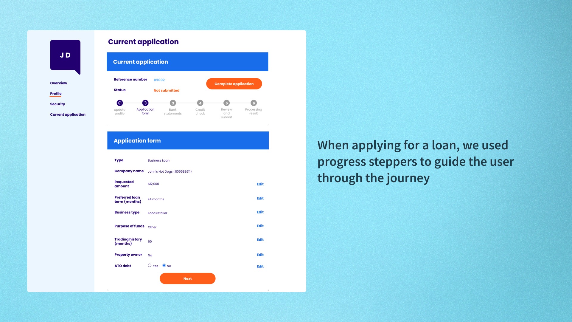
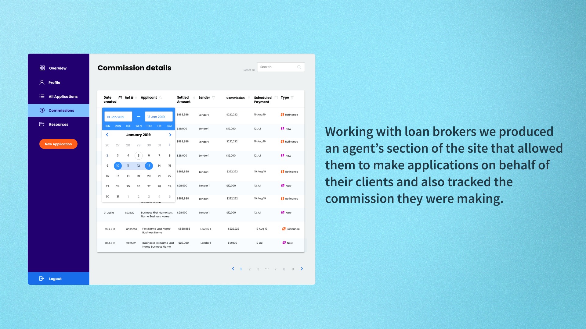
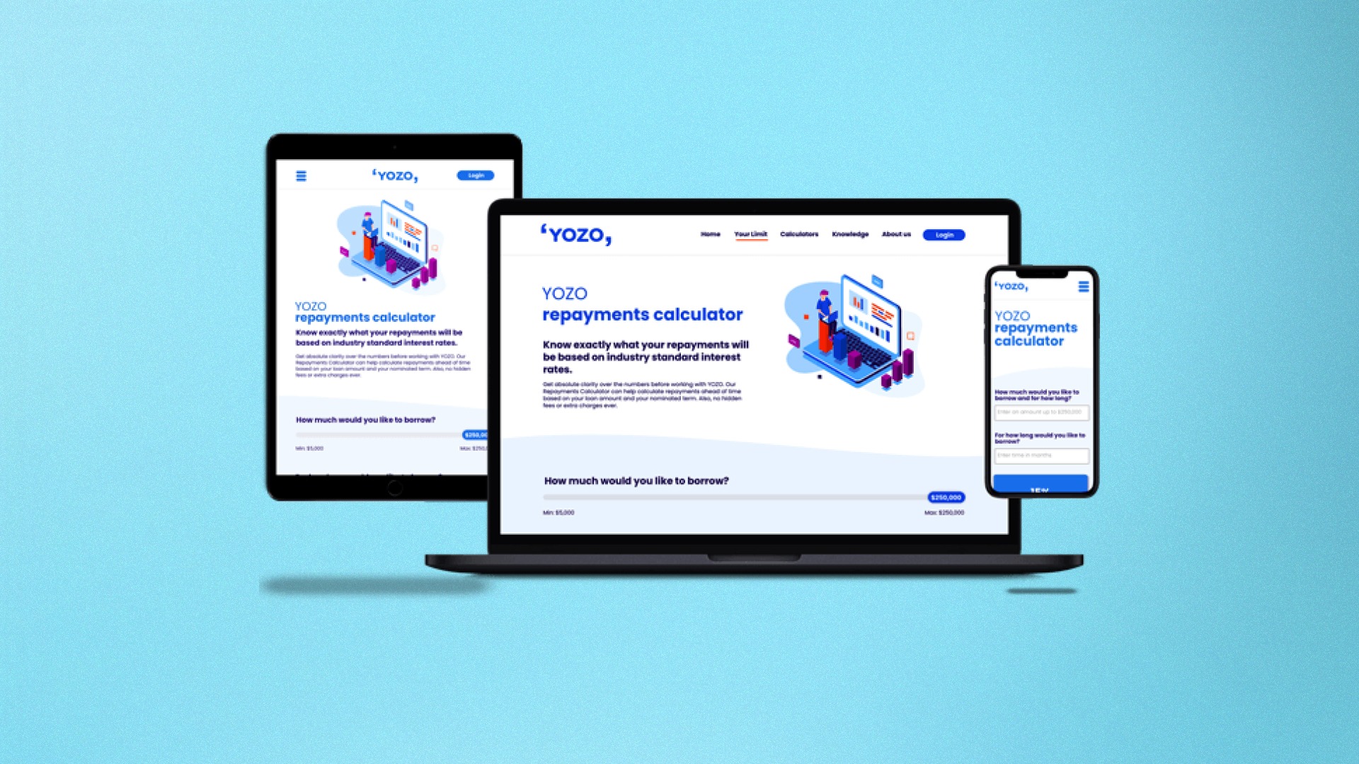
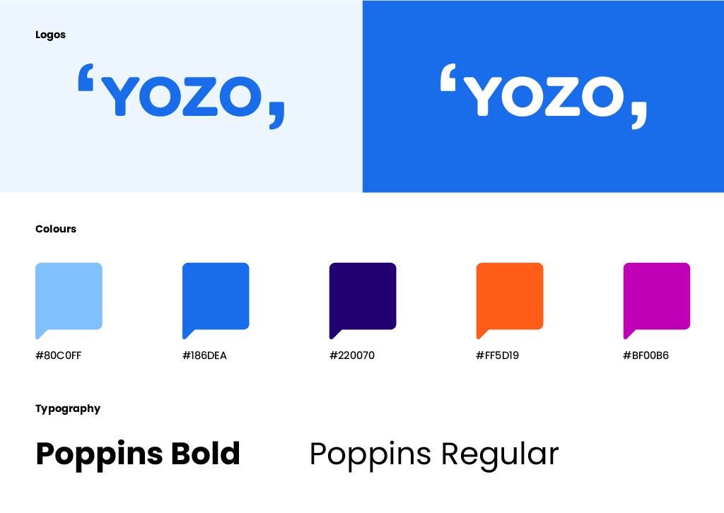
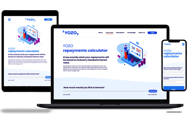
Working with an existing style-guide of the website I was responsible for designing components, enhancing the interactions, visual design, and user-flows to help small businesses access the capital they require to grow sustainably.


product design lifecycle 

 In SUMMARY

DISCOVERY

Over the first couple of days, I spent some time seeking to properly understand the scope of work, so we could plan out our work as best we could. 

This meant:

  • digging into their newly created brand guidelines to understand how I could apply them to their site
  • clarifying details on the features within the site, used to acquire and retain loan brokers, and businesses
YOZO brand guidelines

warp speed design ideation

We spun up designs for components, flows and pages at pace.

Working face-to-face as well as remotely, we utilised InVision to quickly communicate design decisions, behaviours, and user-flows. This allowed for a quick feedback and iteration loop as we finalised interface designs and their development.

YOZO Responsive mockups

ITERATIONS AND MAINTANENCE

One of the more challenging aspects, particularly when working at such a high velocity. The file hygiene was not fantastic, so when it came to iterating, it was always possible but our efficiency suffered due to poor layer naming, and components not saved as "symbols" .

Still, we persevered and through this action we sought to improve file hygiene in few moments of downtime that we had.
A google drive folder FULL of design iterations!!

INTERACTION CONTEXT

A few of the UI elements that YOZO had on their test site were a bit of a challenge to replicate and have the same level of usability, particularly on smaller mobile devices.

While the desktop slider has a nice, creamy transition from $5,000-$250,000 allowing the user to create control to say select, $21,000, on mobile this would have required the deftest of touches with a target area so small.

To ensure YOZO could keep on their timeline for the brand launch, we opted to use a simple form input field for both amount and loan term.

Yozo site responsive site mockups

  • A mockup of the Yozo repayments calculator
  • A mockup of the Yozo repayments calculator
  • A mockup of the Yozo Borrowing Limit screen
  • A mockup of the Yozo application page
  • A mockup of the Yozo Loan partners commission screen

Key achievements

  • Launched the product on time!
  • Worked, hard, fast, and scrappy without losing my mind
  • Designed my first fintech product

challenges and lessons learned

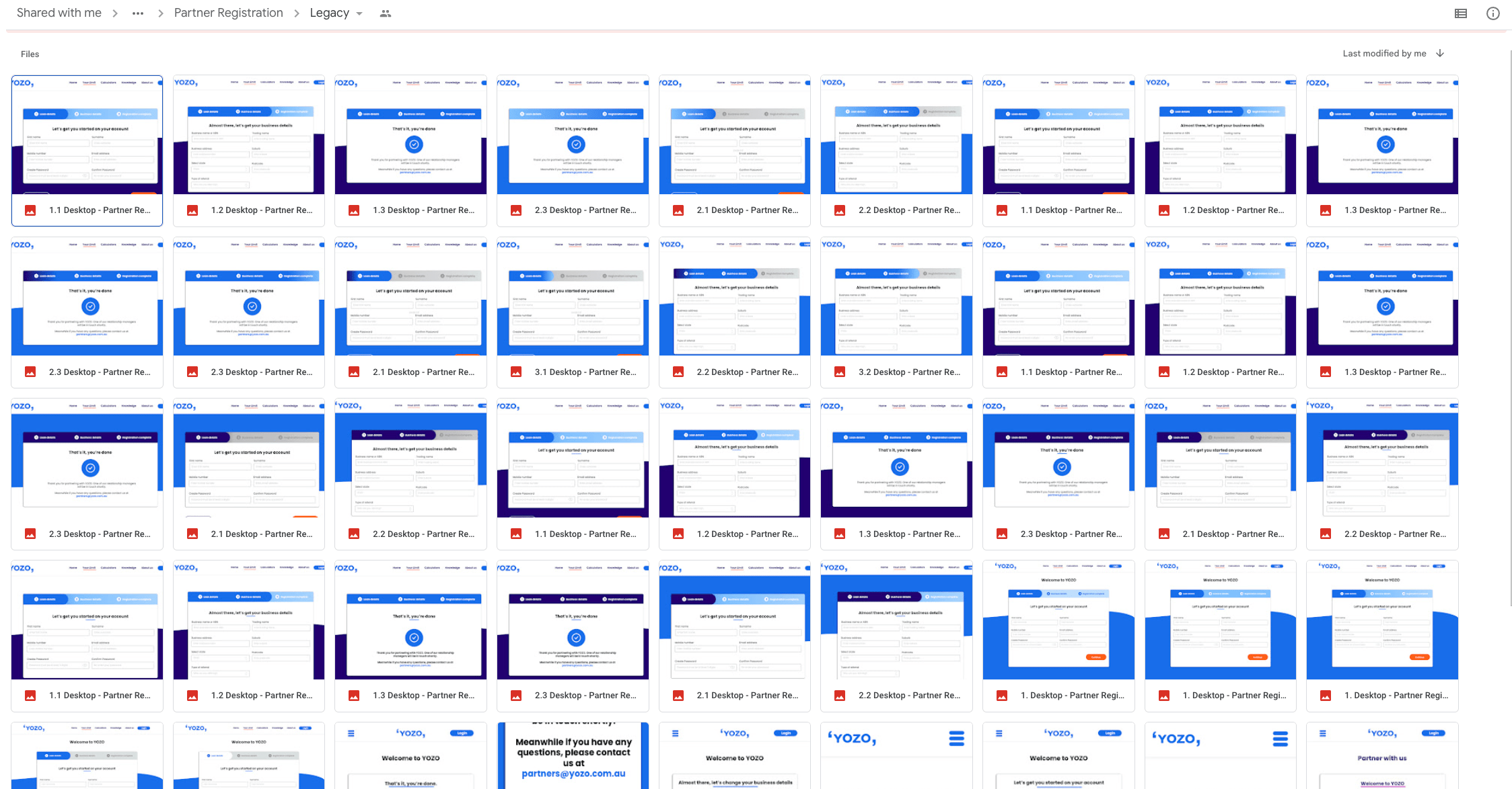
As silly as this sounds, I was reminded why its always a good idea to spend some time naming all your layers and looking for ways to utilise efficiency with the tools you are using. During this project by creating 'Symbols' in Sketch, I was able to save a hell of a lot of time as I duplicated elements across multiple boards and could iterate quickly.

Fountain of Hygiene

Award-winning design

App concept – Buggy

See the entry

Connect with me on LinkedIn

Let's network