subscription funnel

Taking the business toward a premium subscription model that would provide users exclusive content and features and reduce our reliance on Ad revenue.

Subscription offer page

the problem

We have millions and users and loads of content, we should charge for some of it.

Immediate Media, has a portfolio of brands that have highly loyal, highly motivated users. On a daily basis, tens of millions of users visit our sites and we rely heavily on Ad revenue.

Other company's in the publishing industry had proven that subscription models could work if you properly new your audience, what you could offer them and the price they'd be willing to pay.

Through our research, they also have a high propensity to pay for content their deem of a high quality and relevant to their interests. When we commenced this project, we had no facilities to put content behind paywalls, nor did we have the technology to process payments.

Business Goals

  • Implement the necessary technology to put content behind paywalls
  • Implement the necessary technology to process payments
  • Launch a subscription service with HistoryExtra
  • Open up new revenue stream for the business

MY role | 

UI + UX Designer

I was tasked with working with my product team, third parties and stakeholders in delivering features that would

  • Clearly define what is premium content and what is free
  • How users could access that content (data wall or paywall)
  • What premium offerings we could provide users
  • Facilitate the payment and management of subscriptions
Hypothesis – Through progression of datawalls and paywalls we can prime users for premium/ paid for content.

project Goals

  • Understand our loyal user's propensity to pay
  • Produce a strategy for getting users through a paywall funnel
  • Create data wall and paywall experiences
  • Optimise checkout funnel

Project background

This was a project that was broken up over several epics of design and development and delivered in a phased approach.

We needed to first design and build experiences that served the different value propositions that our brands were offering. Some brands still wanted to offer all of their content for free, while others either wanted to provide a completely premium experience or a blended model with only a portion of their content behind a paywall.

We were tasked with creating a solution that catered to all of these needs and allowed us to experiment with different propositions as we sought to find the sweet spot with our loyal users.

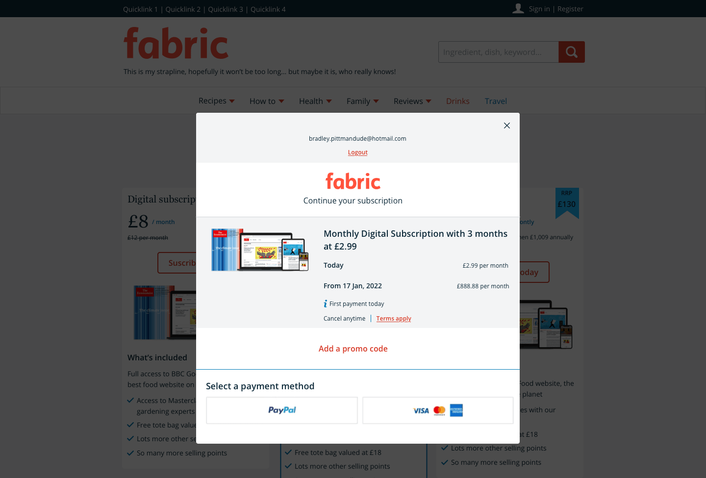
For our premium content, we needed to design and build digital products and checkout functions.

product design lifecycle 

 In SUMMARY

MESSAGING EXPERIENCES

Using Piano, a third-party technology, we designed and built our MVP components that provided brands the opportunity to experiment with how they could persuade users to register and/or pay for premium content.

Constraint
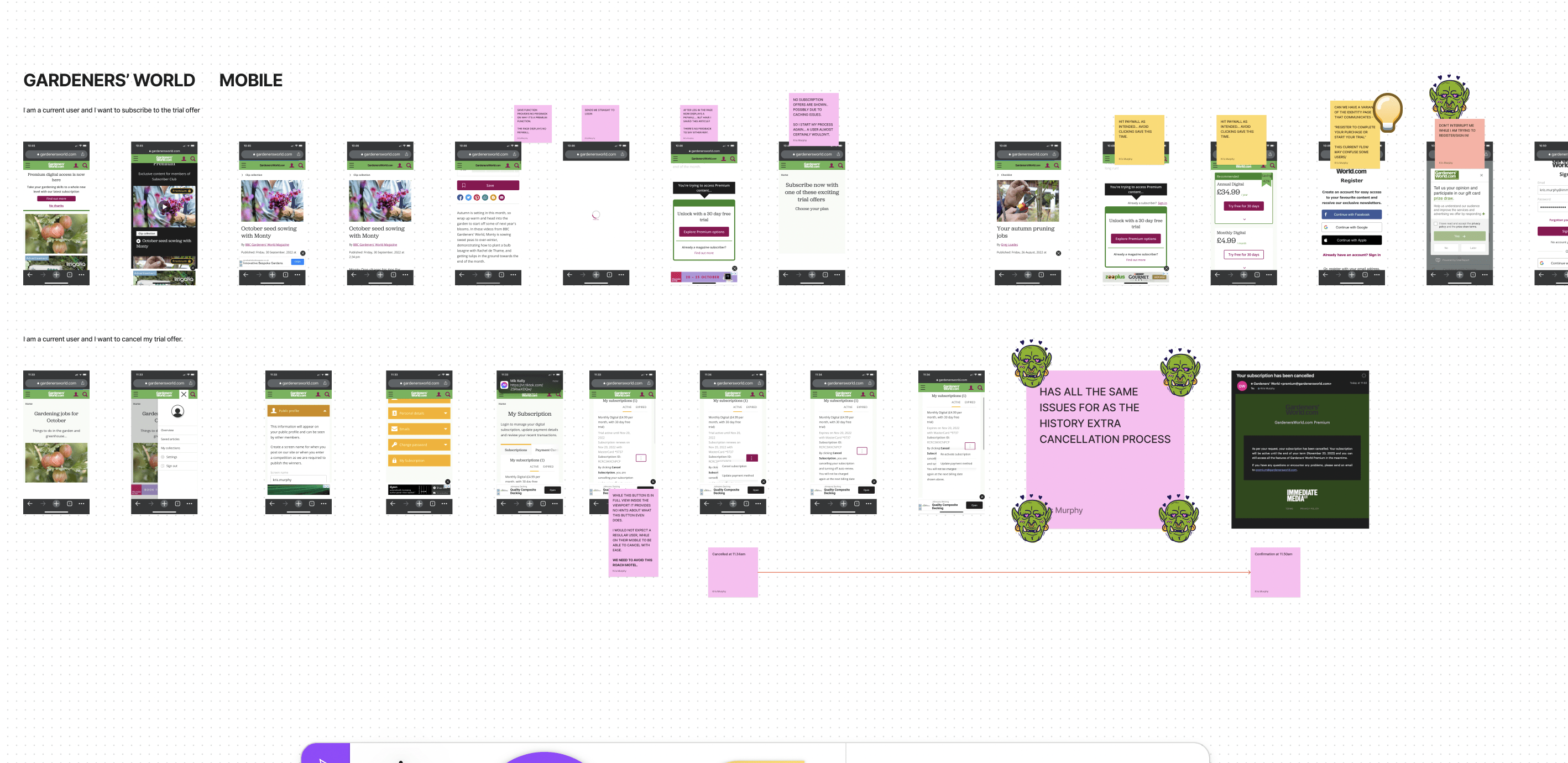
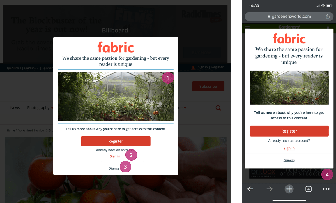
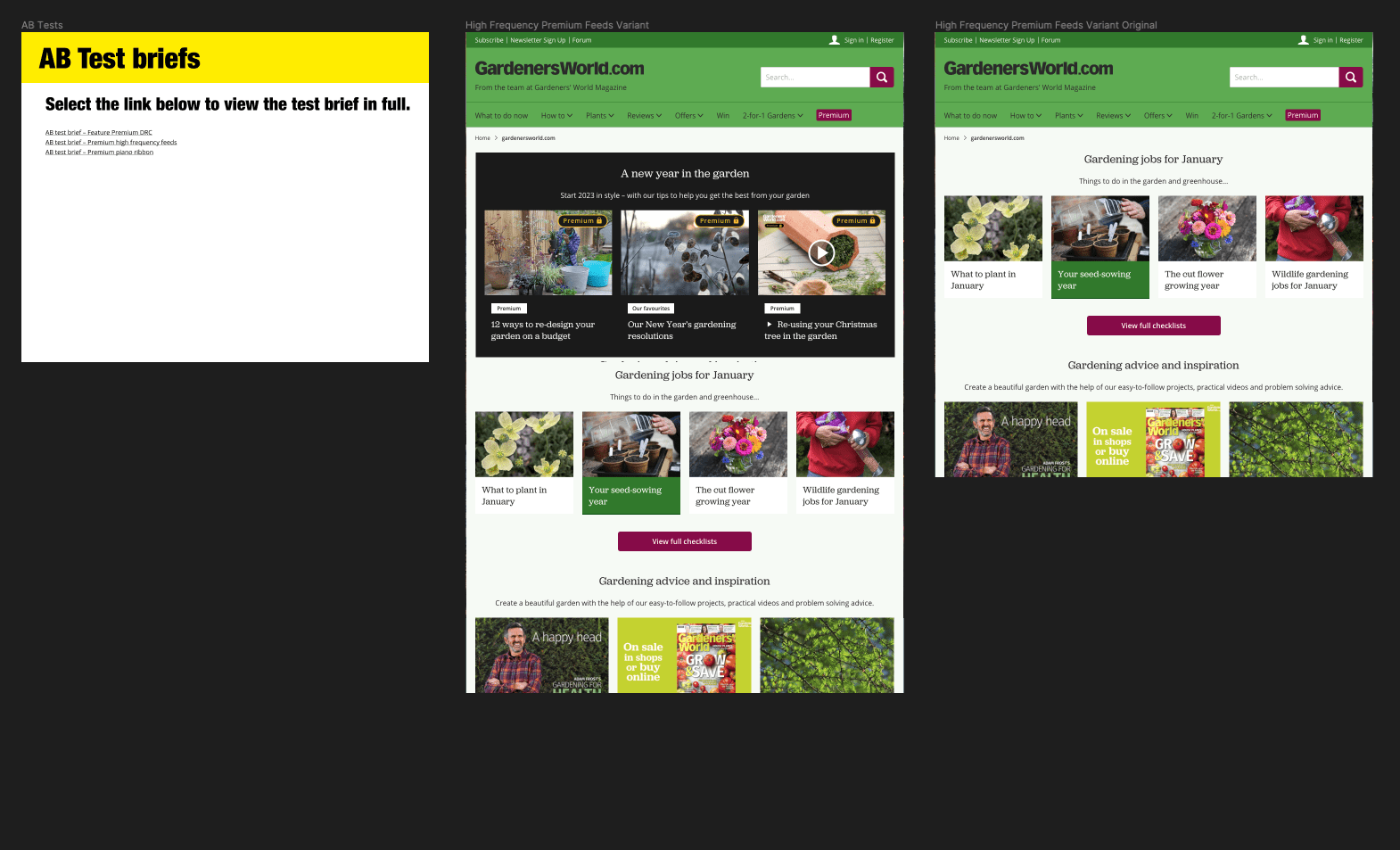
One major design challenge was that normal web conventions had "ribbons" displayed at the bottom of users' screens. On our Fabric platform, one of our best-performing and most lucrative ad slots was our mobile bottom banner. We couldn't obscure this unit or even drop it, so we made the decision to serve our "ribbons" on the top of the browser.

A annotated design of our datawall in our brand agnostic theme, Slate.

premium identifier

For brands seeking to have a mixed offering, some content remaining free and a portion of their content sitting behind a paywall, we need to find a consistent way to communicate to the user.

Through several rounds of user-testing we sought to validate colours, iconography and the wording.

This produced a global pattern that we deployed across all fabric brands.

It was universally understood that "premium" meant that content needed to be paid for.

We also found that when premium content was grouped together it increased its visibility and likelihood of users interacting with it.
A mockup of a fabric site with premium content

PAYWALLS

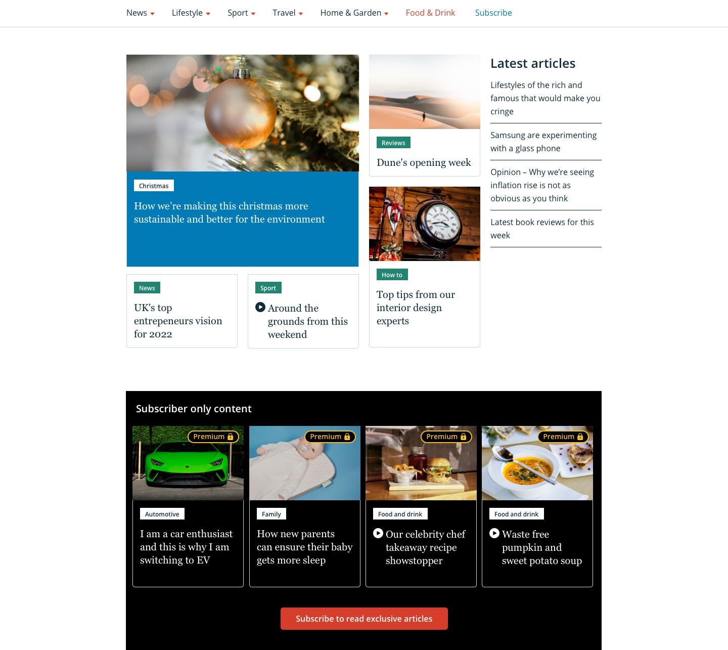
Through competitor analyses and user testing, we determined that serving an inline paywall on articles that truncated the content was our best chance of converting users.

  • It was a normal web convention and when coupled with our premium identifiers, users were not surprised to see it.
  • By allowing the user to read a small portion of the content, it would be easier to persuade them to look at our premium subscription offerings.
A slate design of an inline paywall on a premium article

PRODUCT CARDS

This was probably one of the hardest parts of the project, due to the disparate nature of our print and digital offerings.

We have a business, Buy Subscriptions, which serves as our e-commerce arm for selling print copy subscriptions for Immediate Media brands. Due to this the amount of development effort to build a seamless on-site experience for purchasing print subscriptions was not worth the ROI.

We were also unable to sell bundles of digital and print subscriptions as part of our MVP due to the constraint mentioned above.

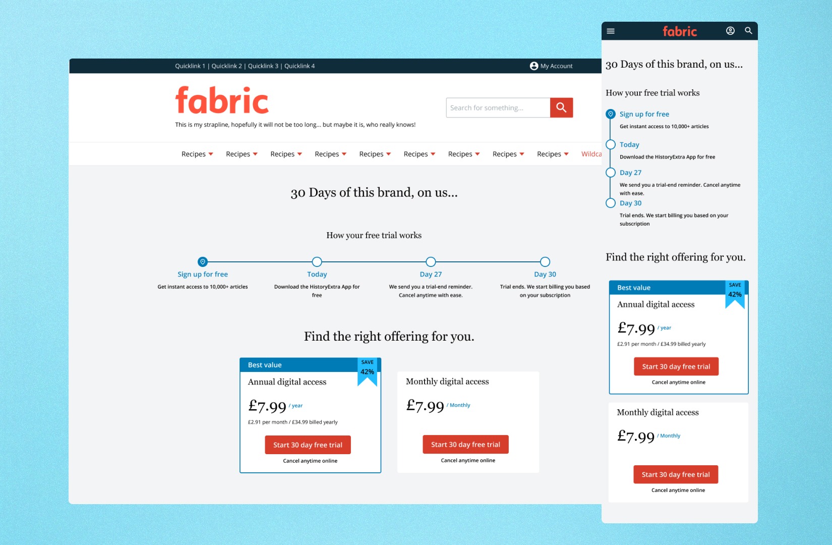
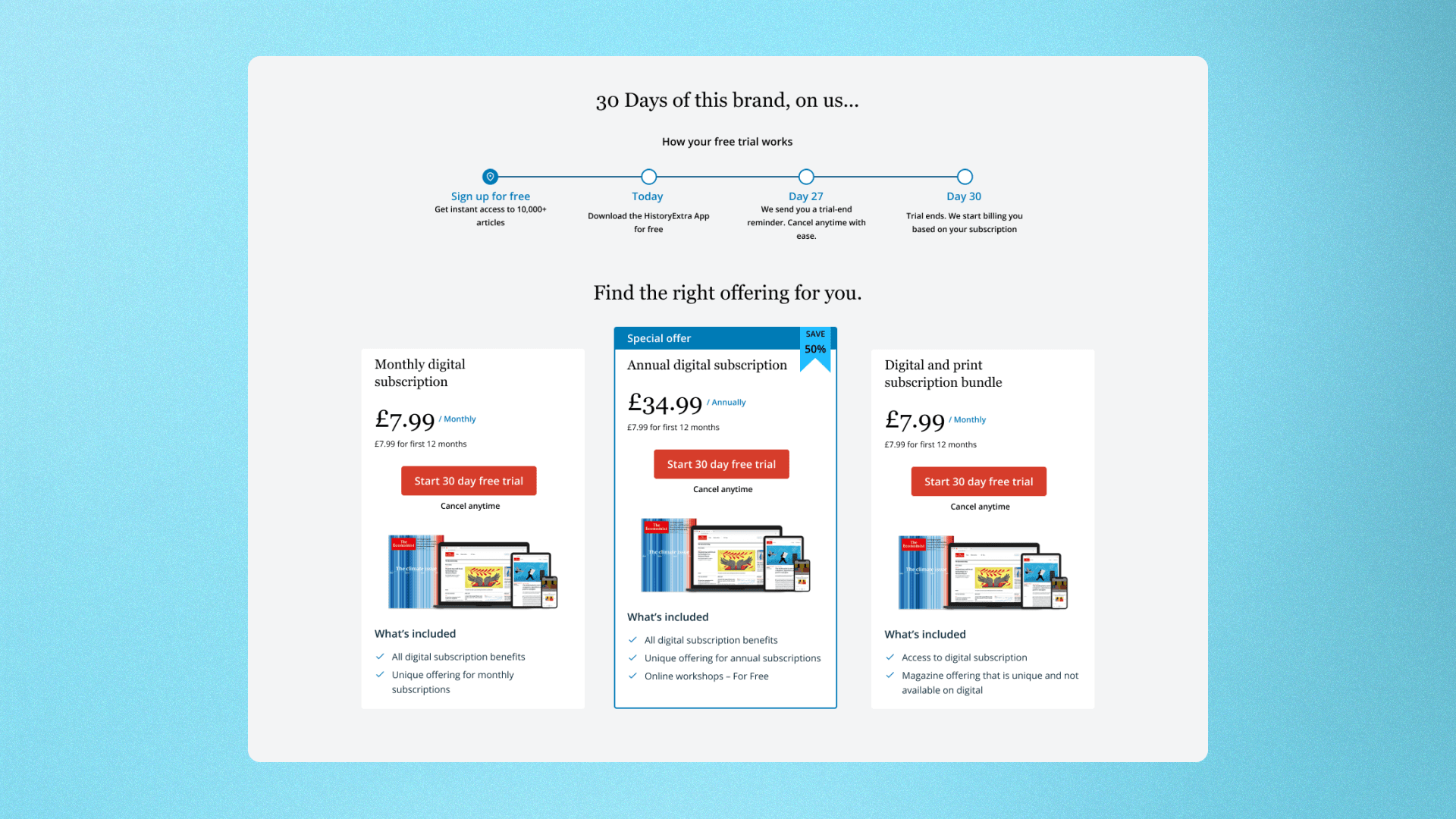
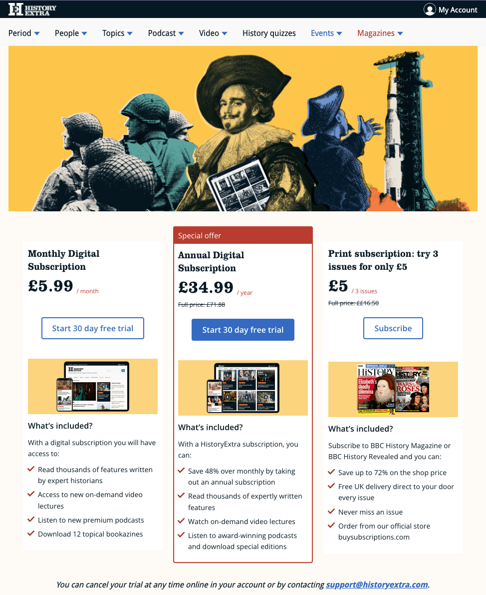
What we were able to do was to design, test and build product cards and product page that gave the user three options for them to trial and/or purchase.

Typical podium design
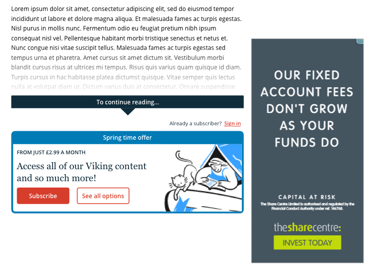
A very common pattern used on subscription pages is to draw the users' attention to the product we believe to be the best value or the one we want you to purchase. This is an application of the "Von Restorff Effect" 


CHECKout

The whole experience was being served by the third-party service Piano, so to ensure we met our deadline it was prudent to deliver an experience that didn't deviate too much from Piano's "out-of-the-box" solution. This solution had the payment experience through Stripe.

This meant that we delivered our checkout within a model, which was not an ideal experience given the amount of information we needed to communicate to the user as it did not allow us to properly compartmentalise the process into individual sections on screens and users had to scroll up and down a long form to ensure that any errors were resolved.


A slate design of the subscription checkout

FLOW AUDIT

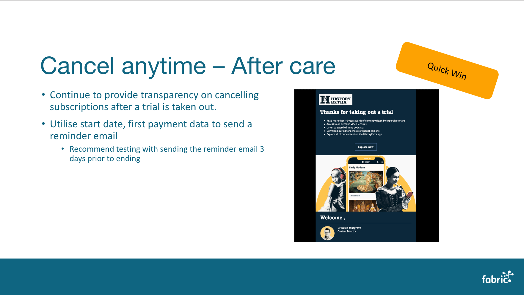
Post-launch, we took some time to see how things played out. We adjusted things like copy, but overall the experience remained untouched for several months.

When we picked this back up, we wanted to look into areas within the product that we could seek to improve.

The two major areas we wanted to improve where our subscriptions offer page and our checkout as we were seeing the biggest bounce rates on these two steps of the journey.

  • Provide clearer information on how the trial subscription works to reduce the fear of forget and bill shock.
    • "free trials tend to trick people into subscribing via auto-renewals"
    • "I was worried I'd forget when it was ending"
  • Improve the structure of information provided within the checkout modal


flow OPTIMISATION

Following our audit, new had cut a clear path towards improving subscription trial sign ups and reducing churn at the checkout.

Working with stakeholders, I helped them understand the benefits to the business of transparency in our communication and how it will help us achieve our longer-term goals of doubling subscription numbers.

Premium discoverability

Another key area we wanted to explore was how we might be able to put more premium content in front of our users in an effort to increase the click through rates to our premium content.

We developed three AB tests with the following hypotheses:

  1. We believe that by putting a feed of exclusively premium content at the top of high traffic pages (e.g. Homepage) we can increase the number of views on premium content and convert more users into subscribers.
  2. We believe that by featuring premium content in a Piano ribbon we can increase the discoverability of premium content and increase subscriptions 
  3. We believe that by featuring premium content in the Dynamic Related Content widget we will increase discoverability and therefore click through rate of this content 
To AB test variants for Gardeners' World

responsive subscription pages

A mockup of the subscriptions offer page on desktop and mobile

Key achievements

  • Delivering premium propositions across three major brands
    • HistoryExtra, BBC GoodFood and Gardeners' World
  • Making some key improvements to the subscription funnel that improved the number of trial conversions

what i learned from this project

Sometimes you can't win over stakeholders with facts, we are visceral and instinctive and sometimes we're stubborn.

It's important that as a team, we win together. Navigating tricky stakeholders isn't something new for me, but this project presented its challenges through the form of getting buy-in from key stakeholders.

  • Product design is not about just about pretty, its about function
  • User testing is an essential part of validating hypotheses
  • We should let all the data we have on hand guide us and be okay that we're making some assumptions
  • Transparency with customers should not be given up for a quick buck... think longer term.

Connect with me on LinkedIn

Let's network